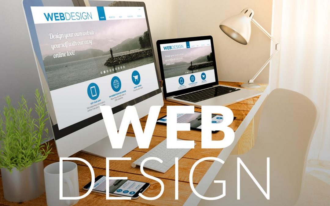
Creating a web design for your website plays the most important role in the success of your business or organisation. This is all about reaching or attracting the customers towards your business to showcase your organisation. Responsive web design and development can benefit designers, business, developers and also the users in several ways such as:
More Mobile Traffic
According to the reports from Similar Web, in U.S. there is more than half of traffic to top websites comes from mobile devices in the year 2015. Therefore, it is important for the companies to have websites which can be rendered properly on the small screen like mobile devices which means it should be mobile friendly. Many professional website design company suggest to have a separate version of their website for mobile users because of it offers great visibility at lower development cost.
Lower Costs
Considerably, to make one responsive website takes less time rather than making a stand-alone or professional website design application. Since time is money, therefore responsive design naturally cost less than the alternatives. Creating two separate websites for a particular business will cost much more rather than building one website which is responsively designed by the designer.
Lower Maintenance
To maintain a separate mobile site, website needs additional support and testing. In contrast to it, the process to develop a website using standardised method ensures optimal layout on every screen. Spending less time marinating the website also frees up time focusing on more important things like marketing and content creation.
Faster Web pages
The mobile users particularly have short attention spans. According to the study, mobile visitors tend to abandon web pages which take longer than three seconds to finish the loading time. To ensure that your responsive website use modern techniques such as caching and images will help you to improve the web page’s loading speed.
Lower Bounce Rates
Responsive and optimised mobile site delivers a much better user experience to the visitors. Therefore, it is seen that users will stick much more around your website for a longer period of time and explore different areas of your site. If your website is not responsive then, it is much harder to keep visitors engaged into your website, as they will bounce back so early.
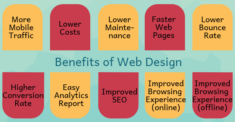
Higher Conversion Rates
To lower, your website bounce rate is the like winning only half of the battle. The key to converting new customers into clients is to create a consistent user experience across all devices. Having a website which looks professional on a single platform and not all platforms is most likely to make the user get frustrated or turn to a competitor.
Easy Analytics Report
To make some informed improvements is to know from where the traffic is coming and how users interact with your website. Having a single website greatly simplifies the process of monitoring. There are many Website design online tools such as Google analytics which caters to track and analyse your website into a single report.
Improved SEO
Responsive web design is as important to search engine optimisation as the quality content. To create stronger back links and better bounce rate translates into higher search ranking, you must create the best web design for your organisation. There are many companies who offer Best business website design to create a site for their business or organisation. According to the Google reports, Google search in the year 2015 expanded its use of mobile-friendliness as ranking signal.
Improved Online Browsing Experience
As the proverb said, “the first impression is the last impression”. Therefore, whether someone is visiting your website for the first time or second time, browsing from their laptops, desktop, tablet or mobile, creating an engaging and consistent positive experience for your user is the must. Therefore, create your website in an interactive and engaging manner.
Improved Offline Browsing Experience
Now that, smartphones and tablets are HTML 5 enabled, therefore responsive designs benefit users by making it easier to continue by viewing content within HTML 5 web applications without an internet connection.
 MEWS is a full service web development Internet marketing company and technology integrator founded in 2003, by leading industry consultants with previous technology experience.MEWS is an Internet services and solutions company with interests in website development – Mobile applications– domain name registrations - web hosting.