Effective Web Design Principle #1: Visual Hierarchy
Squeaky wheels get the grease and prominent visuals get the attention. Visual hierarchy is one of the most important principles behind good web design. It’s the order in which the human eye perceives what it sees.
Exercise. Please rank the circles in the order of importance:
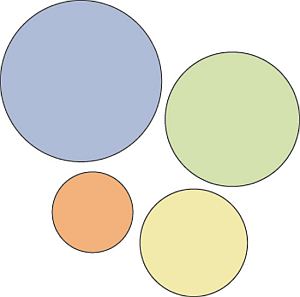
Without knowing ANYTHING about these circles, you were easily able to rank them. That’s visual hierarchy.
Certain parts of your website are more important than others (forms, calls to action, value proposition etc), and you want those to get more attention than the less important parts. If you website menu has 10 items, are all of them equally important? Where do you want the user to click? Make important links more prominent.
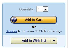
Hierarchy does not only come from size. Amazon makes the ‘Add to cart’ button more prominent by using color:
#2: Divine Proportions
Golden ratio is a magical number 1.618 ( ) that makes all things proportioned to it aesthetically pleasing (or so it is believed).
Then there is also the Fibonacci sequence where each term is defined as the sum of the two previous terms: 0, 1, 1, 2, 3, 5, 8, 13, 21 and so on. The interesting thing is that we have two seemingly unrelated topics producing the same exact number.
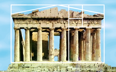
Here’s what the golden ratio looks like:

Many artists and architects have proportioned their works to approximate the golden ratio. A famous example is Pantheon built in Ancient Greece:
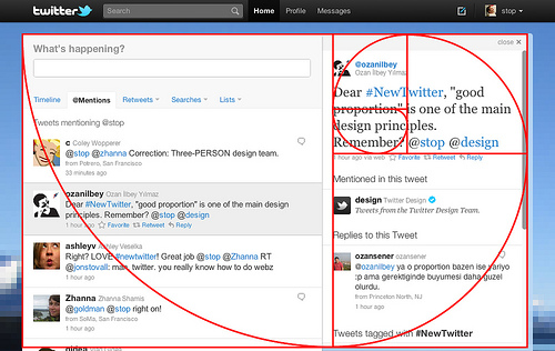
Can it be used for web design? You betcha. Here’s Twitter:
#3: Hick’s Law
Hick’s law says that with every additional choice increases the time required to take a decision.
You’ve experienced this countless times at restaurants. Menus with huge options make it difficult to choose your dinner. If it just offered 2 options, taking a decision would take much less time. This is similar to Paradox of Choice – the more choice you give people, the easier it is to choose nothing.
The more options a user has when using your website, the more difficult it will be to use (or won’t be used at all). So in order to provide a more enjoyable experience, we need to eliminate choices. To make a better web design, the process of eliminating distracting options has to be continous throughout the design process.
In the era of infinite choice, people need better filters! If you sell a huge amount of products, add better filters for easier decision making.
#4: Fitt’s Law
Fitt’s law stipulates that the time required to move to a target area (e.g. click a button) is a function of the distance to the target and the size of the target. In other words, the bigger an object and the closer it is to us, the easier it is to use it.
Spotify makes it easier to hit ‘Play’ than other buttons:

They also place it (on the fullscreen Desktop app) in the bottom left corner, which is considered the most valuable real estate since the corners are technically the most accessible. This does not, however, apply to web design (due to scrolling and the way operating systems are).
It doesn’t mean that bigger is always better. A button that takes up half the screen is not a good idea, and we don’t need a mathematical study to know this. Even so, Fitts’ law is a binary logarithm. This means that the predicted results of the usability of an object runs along a curve, not a straight line.
A tiny button will become much easier to click when given a 20% size increase, while a very large object will not share the same benefits in usability when given the same 20% boost in size.
This is similar to rule of target size.
The size of a button should be proportional to its expected frequency of use. You can check your stats for which buttons people use the most, and make popular buttons bigger (easier to hit).
Let’s imagine there’s a form you want people to fill. At the end of the form, there are two buttons: “Submit” and “Reset” (clear fields).
![]()
99.9999% want to hit ‘submit’. Hence the button should be much bigger than ‘reset’.
#5: Rule of Thirds
It’s a good idea to use images in your design. A visual communicates your ideas much faster than any text.
The best images follow the rule of thirds: an image should be imagined as divided into nine equal parts by two equally-spaced horizontal lines and two equally-spaced vertical lines, and that important compositional elements should be placed along these lines or their intersections.
See how the image on the right is more interesting? That’s rule of thirds in action.

#6: White space and clean design
White space (also called ‘negative space’) is the portion of a page left “empty”. It’s the space between graphics, margins, gutters, space between columns, space between lines of type or visuals.
It should not be considered merely ‘blank’ space — it is an important element of design. It enables the objects in it to exist at all. White space is all about the use of hierarchy. The hierarchy of information, be it type, colour or images.
A page without white space, crammed full of text or graphics, runs the risk of appearing busy, cluttered, and is typically difficult to read (people won’t even bother). This is why simple websites are scientifically better.
Enough white space makes a website look ‘clean’. While clean design is crucial to communicating a clear message, it doesn’t just mean less content. Clean design means a design that makes the best use of the space it is in. To make a clean design, you have to know how to communicate clearly by using white space wisely.
Made.com does white space well:
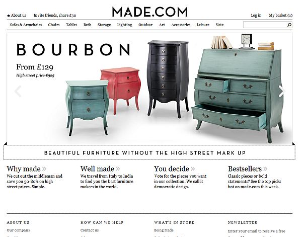
The fine use of white space makes it easy to focus on the main message and visuals, and the body copy easy to read.
White spaces promotes elegance and sophistication, improves legibility and drives focus.
#7: Occam’s Razor
Occam’s razor is a principle urging one to select among competing hypotheses that which makes the fewest assumptions and thereby offers the simplest explanation of the effect. To put it in the design context, Occam’s Razor states that the simplest solution is usually best.
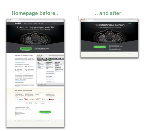
In a post about their Angelpad experience, Pipedrive guys say the following:
The Angelpad team and mentors challenged us in many ways. “You have too many things on your home page” was something we didn’t agree with at first, but we’re happy to test. And it turned out we had been wrong indeed. We removed 80% of the content, and left one sign-up button and one Learn More link on the home page. Conversion to sign up increased by 300%.
It’s not just about the looks, but also about ‘how it works’. Some companies – like 37Signals – have turned ‘simple’ into a business model. Here’s a quote from the book Rework(written by their founders):
Lots of people hate us because our products do less than the competition’s. They’re insulted when we refuse to include their pet feature. But we’re just as proud of what our products don’t do as we are of what they do. We design them to be simple because we believe most software is too complex: too many features, too many buttons, too much confusion.
Simple, minimal design does not automatically mean the design works, or is effective. But in my experience simple is always better than the opposite – and hence we should strive to simplify.
Source: http://conversionxl.com/8-universal-web-design-principles-you-should-to-know/#.

 MEWS is a full service web development Internet marketing company and technology integrator founded in 2003, by leading industry consultants with previous technology experience.MEWS is an Internet services and solutions company with interests in website development – Mobile applications– domain name registrations - web hosting.